London Transport Museum
When I joined the London Transport Museum, the new logo had already been approved, but the wider visual identity was still in its infancy. As part of the core team responsible for evolving the brand, my role was to help transform a logo into a practical identity that designers could confidently apply across every day-to-day touchpoint.
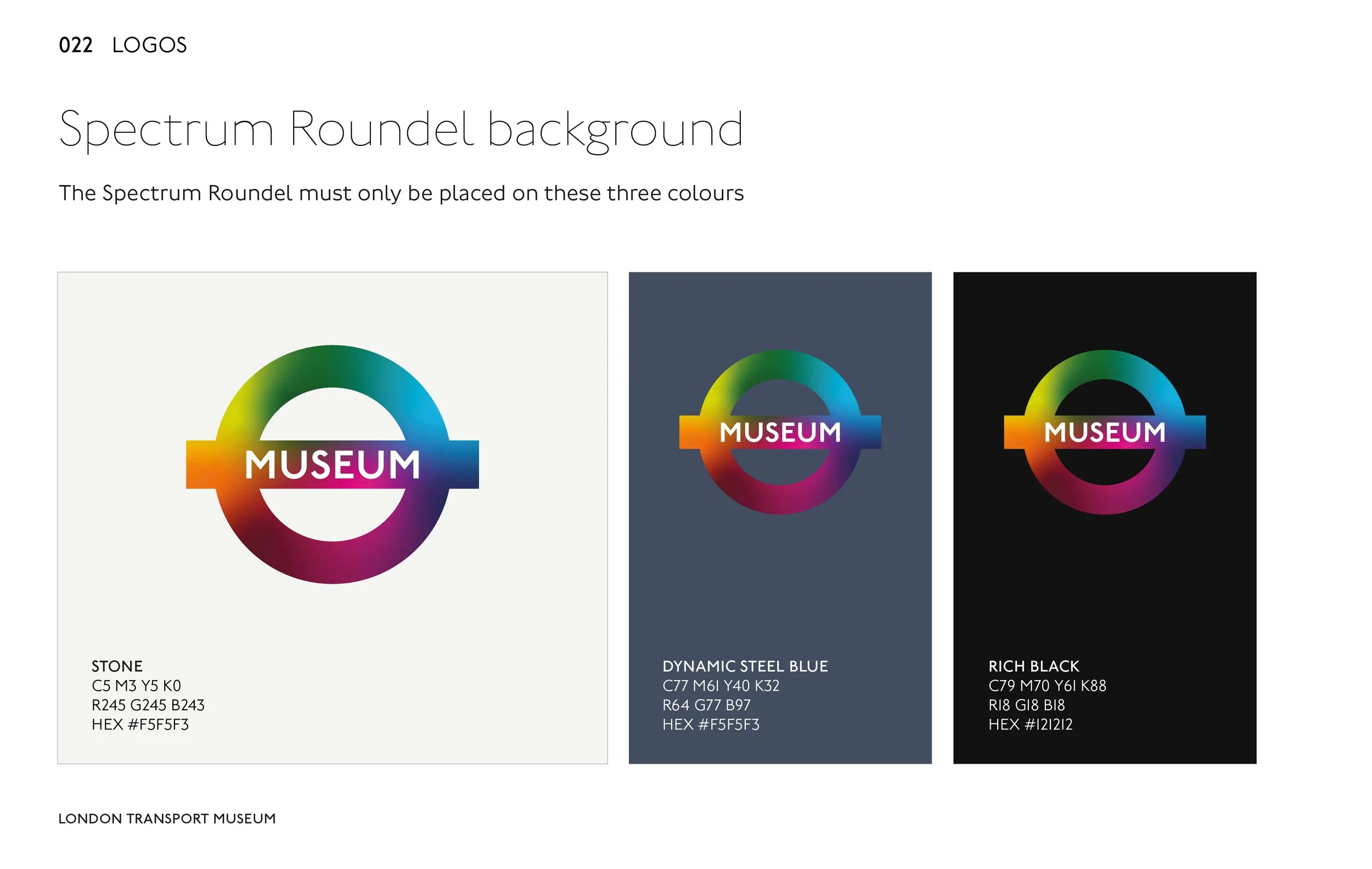
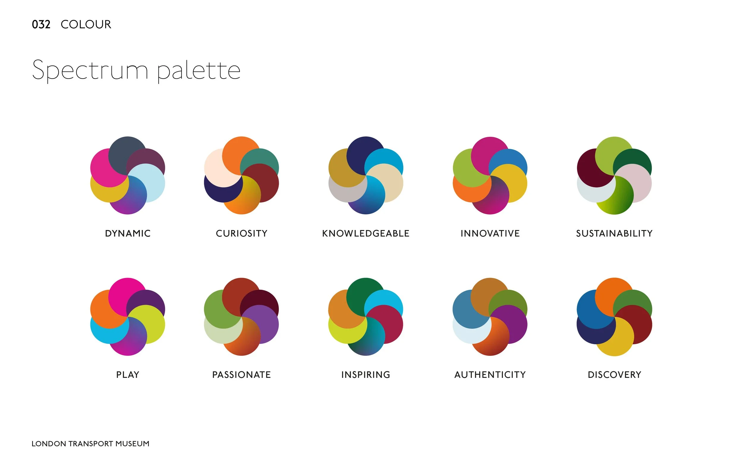
One of my key responsibilities was developing the museum’s colour system. Rather than selecting a handful of colours, I created a structured palette of around 80 colours, carefully organised into logical groups for different applications across digital and print. Alongside this, I established the core neutral palette that would underpin the identity and ensure the logo worked consistently across a variety of backgrounds and environments.
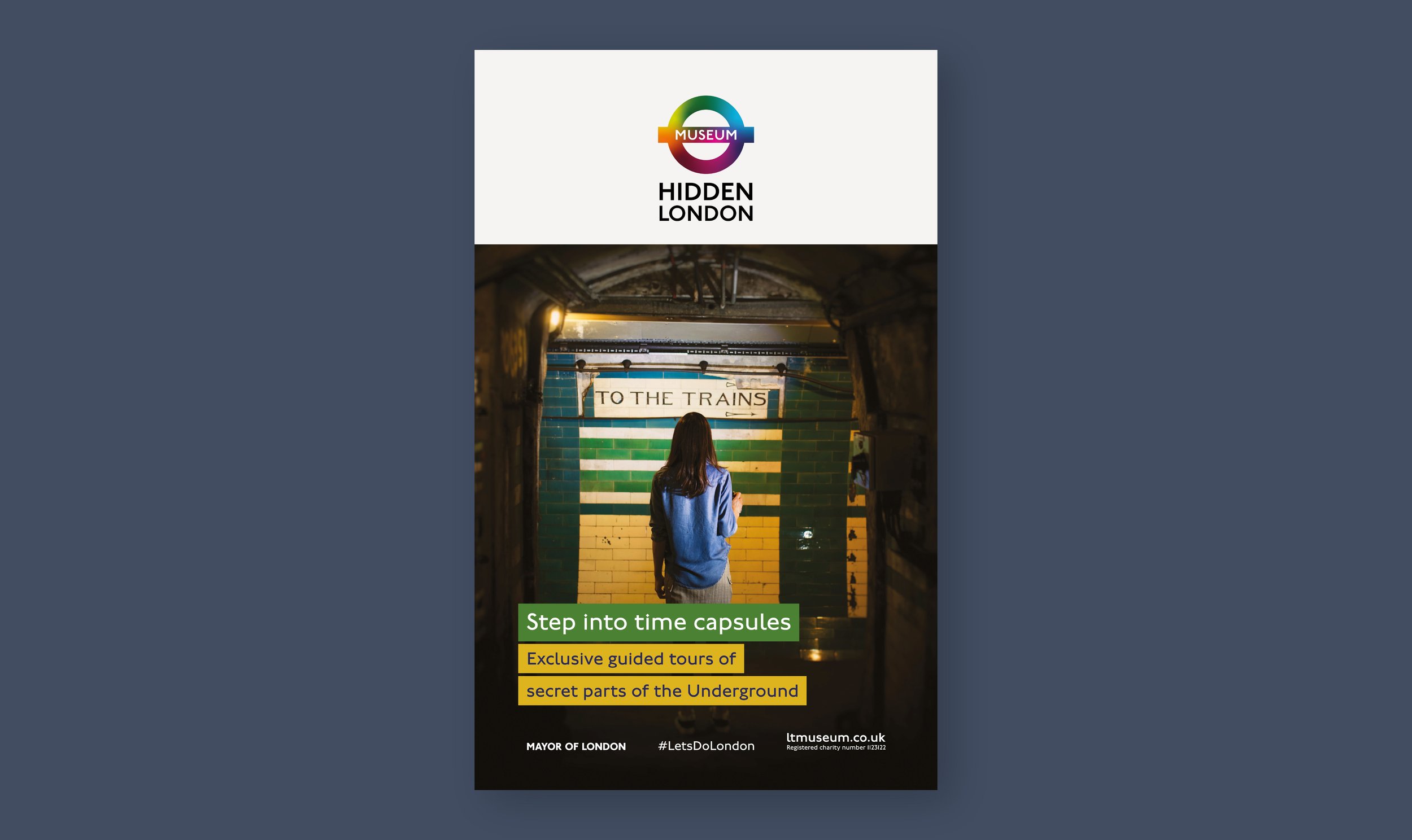
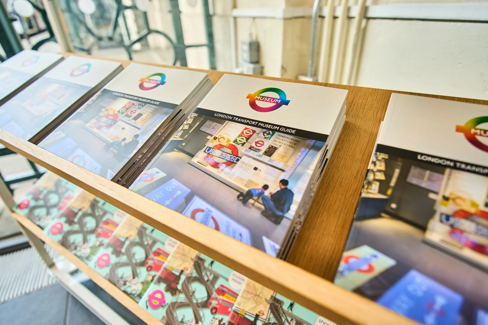
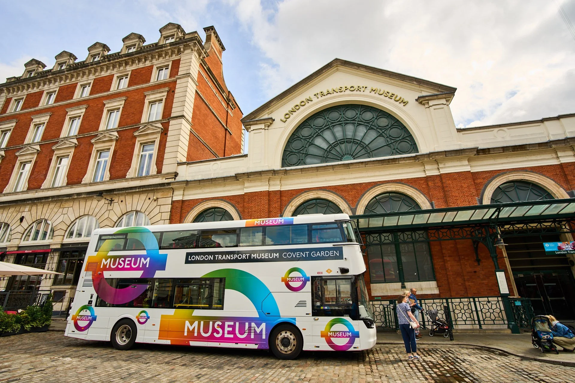
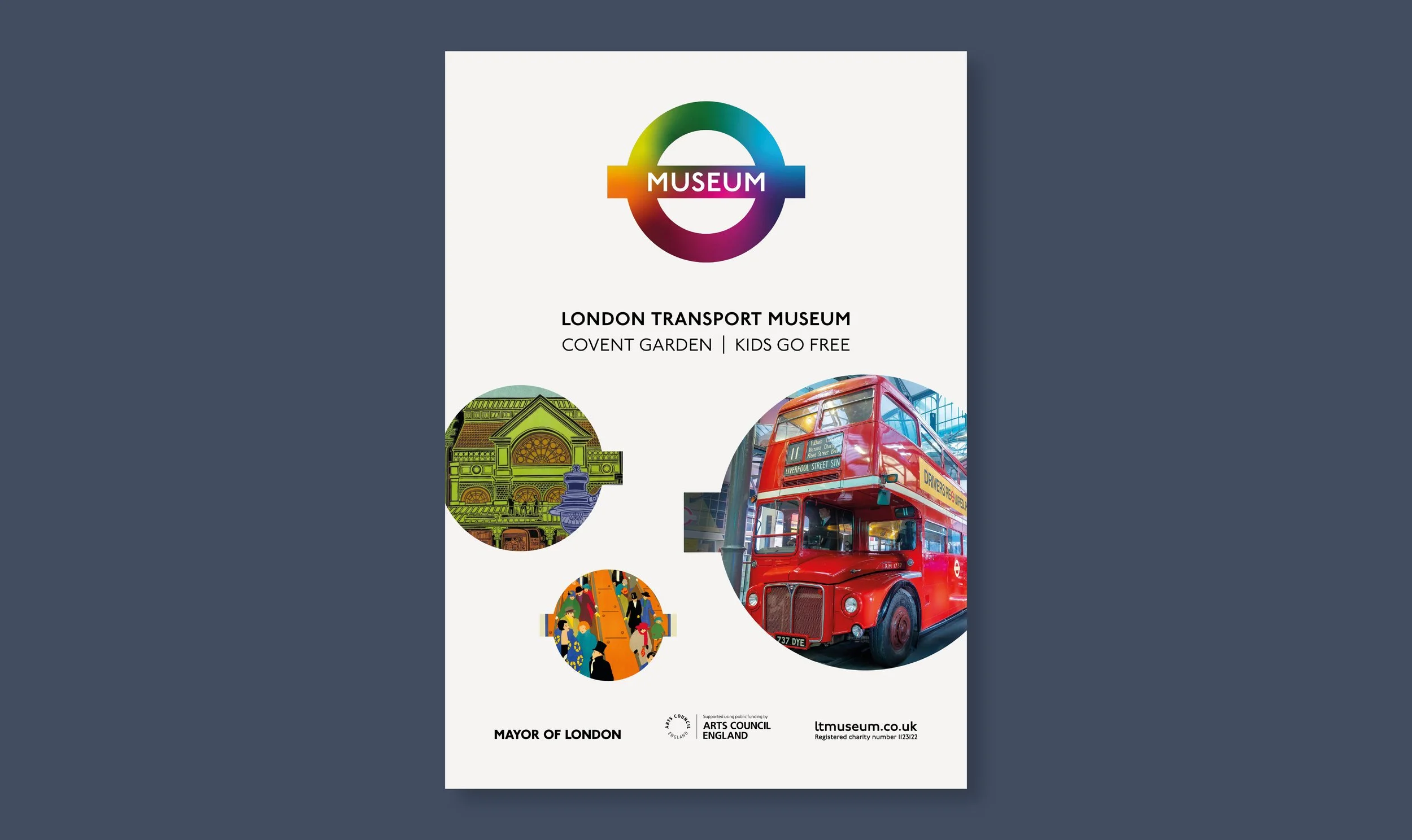
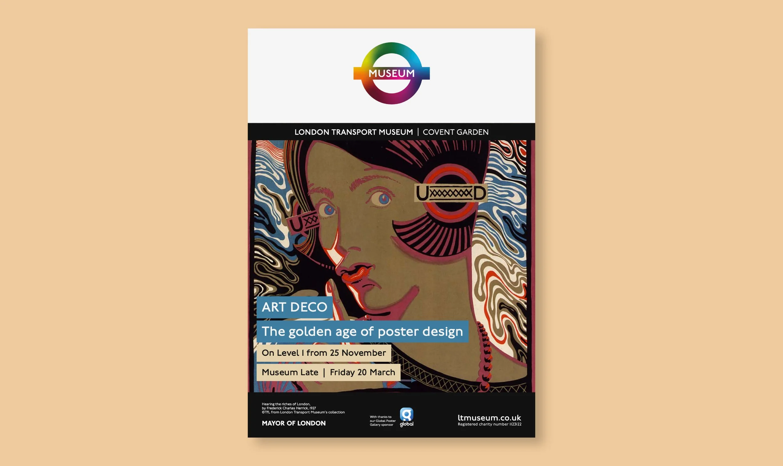
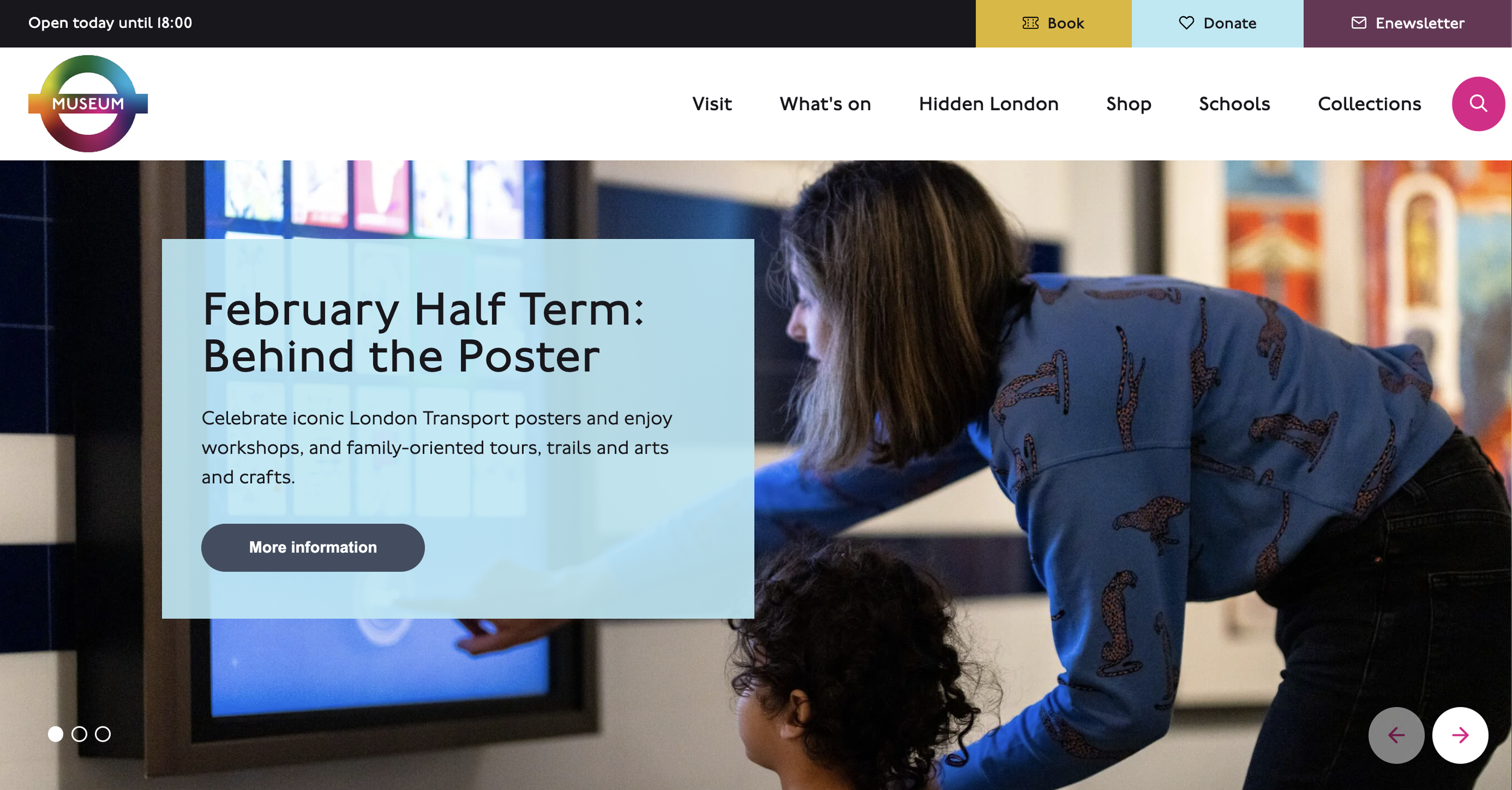
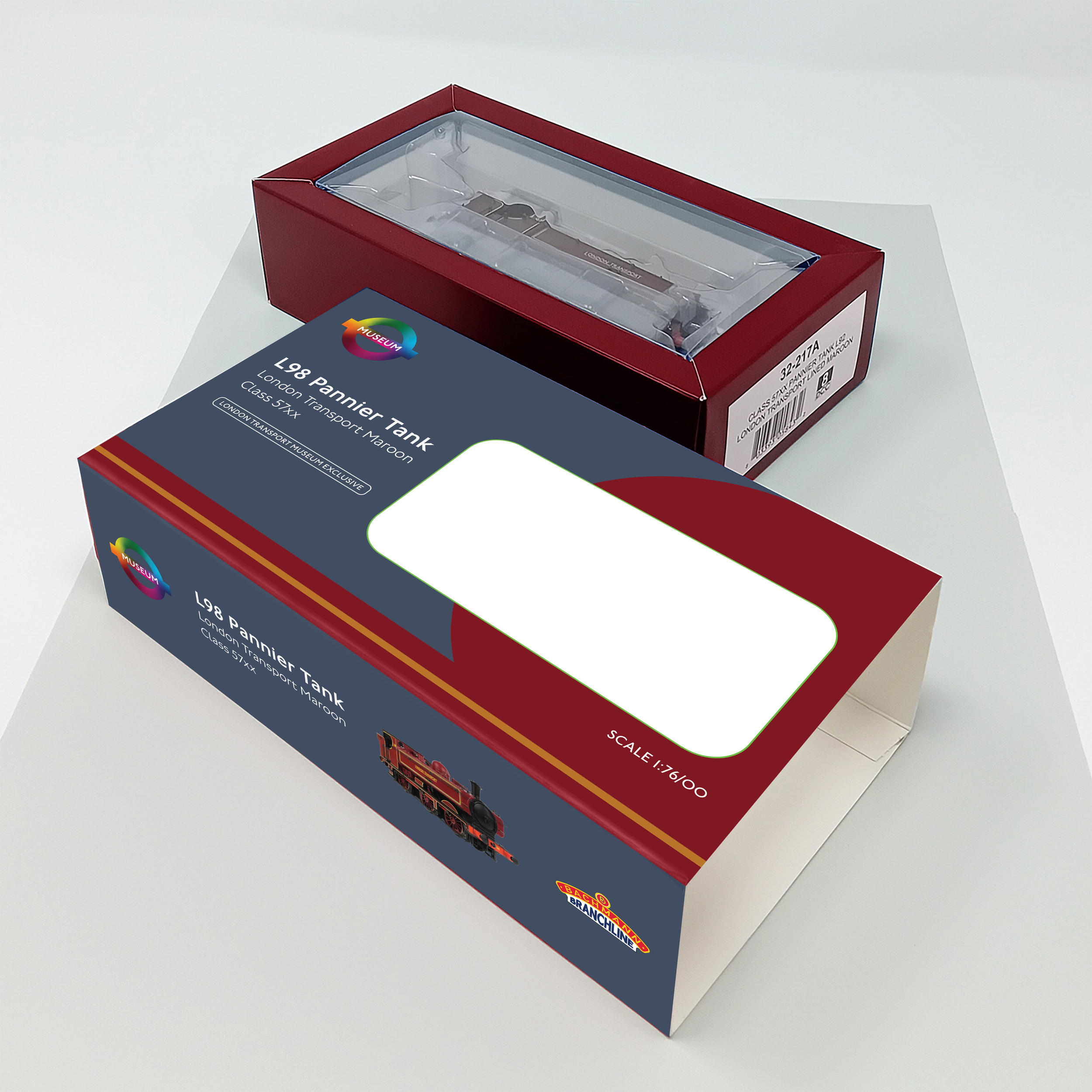
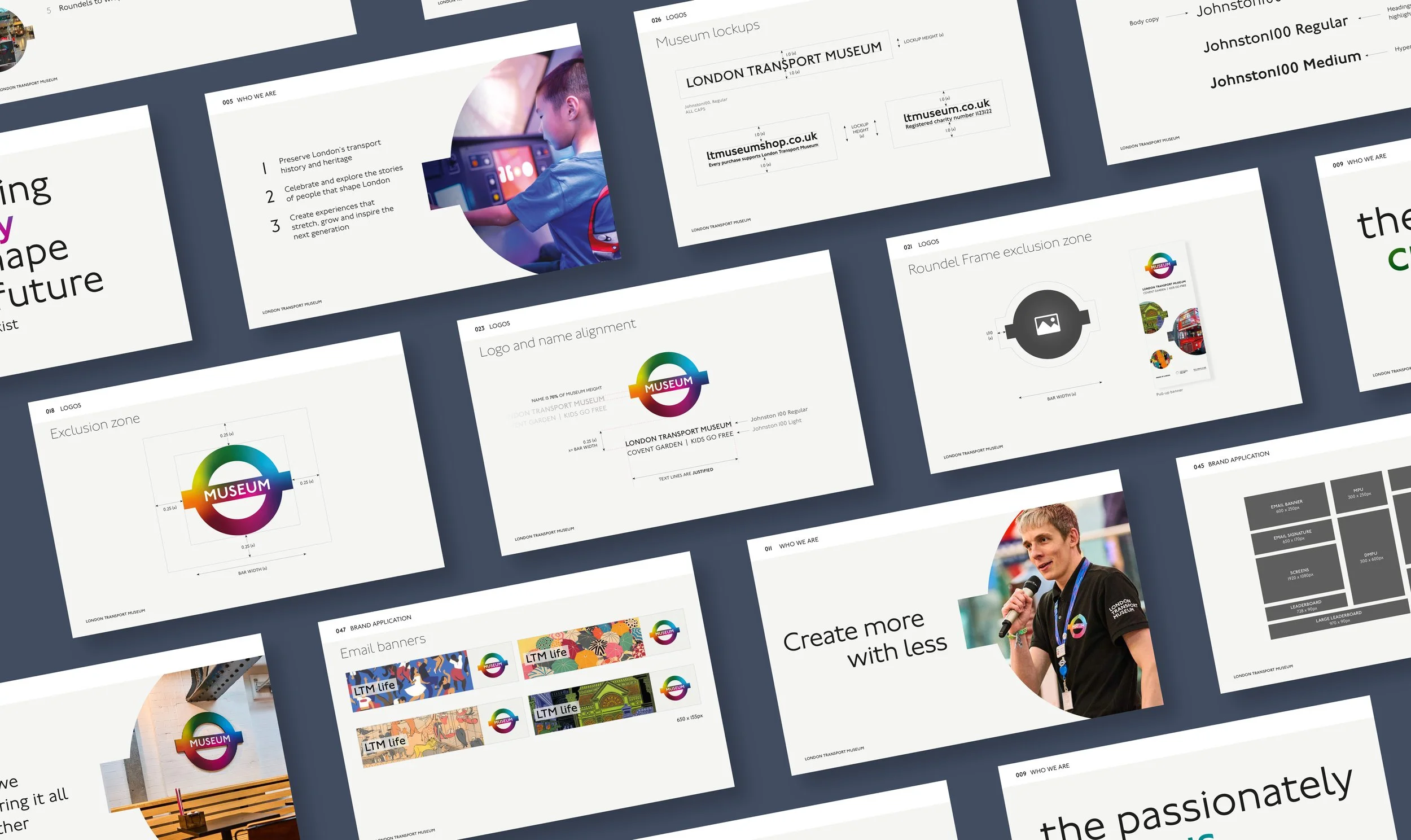
As the identity matured, my focus shifted towards embedding it throughout the organisation. I helped define how the brand should appear across campaigns, exhibitions, marketing, social media and digital communications, creating repeatable visual principles that could be adopted consistently by the wider team. This included developing recognisable campaign devices, refining layout conventions and contributing to the comprehensive brand guidelines that documented the system.
The project required balancing creativity with practicality. Every decision had to be flexible enough to support future work while remaining unmistakably recognisable as London Transport Museum. Rather than designing one-off assets, I was helping establish standards that would shape how the brand was used long after the rebrand launched.
Looking back, this project reinforced one of my greatest strengths: creating design systems that bridge the gap between strategy and implementation. From colour architecture and brand principles to reusable visual conventions, I enjoy building brands that are not only distinctive, but practical, scalable and designed to evolve.